Table of Contents
Introduction
Have you ever stared at a wall of dashboard tiles and realized you couldn't say, without checking each one individually, which numbers actually mattered right now?
You're not alone. It's a well-documented finding across aviation, nuclear power, and hospital intensive care units that operators exposed to constant, always-on alerts become measurably slower to notice the one alert that actually requires action — a phenomenon safety researchers call alarm fatigue. This raises an uncomfortable question for anyone who has built a plant floor dashboard: does showing more information actually make people safer, or does it just make the important number harder to find?
In this article, we'll explore the "dark cockpit" design principle, where it came from, why most manufacturing dashboards violate it without realizing it, and how to redesign a screen so that quiet actually means something.
What Is the Dark Cockpit Principle?
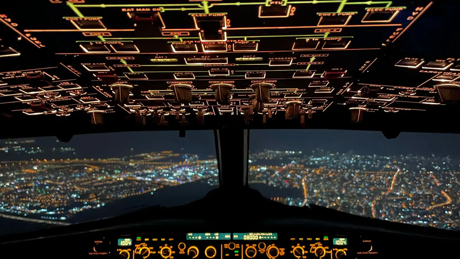
Modern aircraft cockpits are built around a rule that sounds counterintuitive until you've seen the alternative fail: nothing lights up unless it needs a decision. Early cockpit designs were the opposite — dozens of permanently-lit gauges, on the theory that a pilot should always be able to see everything at once.
Dark Cockpit vs. Always-On Display
| Aspect | Dark Cockpit | Always-On Display |
|---|---|---|
| Default state | Quiet, unlit | Fully lit, all metrics visible |
| Attention model | Protects attention for what's abnormal | Demands constant attention |
| Failure mode | A missed light (rare) | Alarm fatigue (common) |
"When everything is emphasized, nothing is."
Alarm Fatigue in Manufacturing Dashboards
The redesign of nuclear and aviation control rooms after high-profile incidents in the twentieth century — including the well-documented 1979 Three Mile Island investigation, which found operators overwhelmed by more than 100 simultaneous alarms during the critical minutes of the incident — permanently changed how safety-critical interfaces are built. The finding was consistent: a screen that treats every metric as equally urgent trains the eye to stop scanning carefully, and the one signal that actually mattered gets lost in the noise of the ones that didn't.
The same dynamic shows up on a factory floor dashboard covered in identically-styled KPI tiles. It looks thorough in a demo. In practice, it trains operators to stop reading it carefully within the first week.
Factors That Turn a Dashboard Into Wallpaper
A few common design habits are responsible for most dashboards quietly losing their operators' attention:
- Uniform Visual Emphasis: Every tile rendered in the same size and color, regardless of whether the underlying number is fine or critical.
- Too Many Permanently Visible Metrics: Displaying every available KPI because the data exists, rather than because an operator needs it mid-shift.
- No Escalation Path: A metric that's drifting has no visual distinction from one that's already out of tolerance.
- Alert Overload: Systems that fire a notification for every minor deviation teach people to ignore notifications altogether.
Strategies for Building a Dark-Cockpit Dashboard
1. Start by Removing Tiles, Not Adding Them
Anything tied to a hard limit — safety, compliance, a contractual spec — stays permanently visible. Everything else defaults to a quiet, low-emphasis state.
What Should Stay Permanently Visible
- Safety Thresholds: Anything that could result in injury if missed.
- Compliance Limits: Regulatory or contractual specs with no tolerance for drift.
- Line-Stopping Conditions: Anything that should trigger an Andon-style response.
2. Build a Real Escalation Ladder
A metric drifting toward its limit should look visually different from one that's already breached it — color, size, and sound should each escalate a step at a time.
3. Run the Thirty-Second Cover Test
Cover the dashboard for thirty seconds, then uncover it. If nothing has visually changed, an operator glancing at it should be able to conclude "still fine" without reading a single number. If that's not true, the screen still has too much permanently-on noise.
The Role of Technology in Filtering Signal From Noise
Modern historian and SCADA platforms, and the AI systems now layered on top of them — including the kind behind predictive quality control — make it easy to display everything they collect, which is exactly the trap. The better use of that same data infrastructure is filtering — using threshold logic and, increasingly, anomaly-detection models to decide what actually deserves a human's attention right now, rather than displaying the full data stream and asking the operator to do the filtering themselves under fatigue.
Real-Life Case Studies
Case Study 1: Post-Three Mile Island Control Room Redesign
Following the 1979 partial meltdown at Three Mile Island, the U.S. nuclear industry undertook a sweeping redesign of control room interfaces, driven in large part by the finding that operators had been overwhelmed by a cascade of simultaneous alarms rather than informed by them. The redesign principles that emerged — prioritizing alarms, suppressing redundant ones, and keeping the default display state quiet — became the foundation of what's now broadly known as the dark cockpit approach.
Case Study 2: Glass Cockpit Adoption in Commercial Aviation
The shift from dozens of individual mechanical gauges to a small number of integrated, mostly-quiet digital displays — the "glass cockpit" — is widely credited by aviation safety researchers with reducing pilot workload and improving response time to genuine emergencies, precisely because pilots are no longer required to continuously monitor instruments that are behaving normally.
Key Takeaways
- A dashboard that treats every metric as equally urgent teaches operators to stop scanning carefully.
- The dark cockpit principle keeps the default display state quiet, reserving emphasis for what's actually abnormal.
- Safety-critical and compliance metrics should stay permanently visible; everything else should earn its place.
- An effective escalation ladder — quiet, drifting, critical — beats a flat wall of uniform tiles.
- The thirty-second cover test is a fast way to check whether a dashboard is actually working as a dark cockpit.
FAQ Section
Q: Doesn't hiding metrics increase risk?
A: It reduces risk. A screen with dozens of always-on metrics trains the eye to stop scanning
carefully. The dark cockpit principle hides only metrics currently within tolerance — anything
abnormal still lights up immediately.
Q: How do we decide which metrics deserve permanent visibility?
A: Start with anything tied to safety or a hard compliance limit. Everything else should earn a
place on the always-on screen only if operators have repeatedly needed it mid-shift.
Q: Won't operators just ignore a quiet dashboard?
A: A quiet dashboard is exactly what keeps people paying attention — it's a noisy one that
trains people to tune out. The rare times something does light up on a dark cockpit, it gets
noticed precisely because it's rare.
Q: What's the fastest first step toward this on our own floor?
A: Run the thirty-second cover test on your current dashboard. Whatever fails that test is your
starting punch list.
Conclusion
In conclusion, the instinct to display every available metric is understandable, but it works against the exact outcome a dashboard is supposed to deliver: an operator who notices the problem that matters, quickly. Borrowing the dark cockpit principle from aviation and nuclear power means designing for quiet by default, and reserving attention for what's genuinely abnormal.
If you'd like a second pair of eyes on your own plant floor dashboard, get in touch — we're happy to run the cover test with you.